 |
|||||||||||
|
|
|
Ad Makeover Fox Valley Animal Referral Center Ad Two: Referral Services
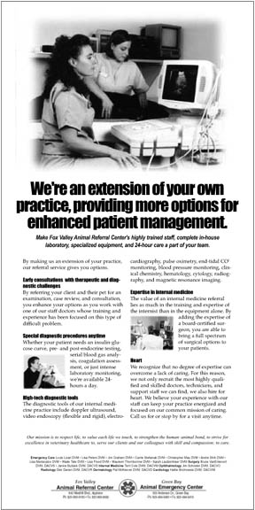
The second ad, for Fox Valley's non-emergency diagnostic and surgical services, is below along with an explanation. You can click on it for a larger view.  Since in this ad we wanted to capture the attention of veternarians who were most interested in diagnostic services, we included an image of a Fox Valley specialist using a piece of diagnostic equipment, large enough for their target veterinarians to notice even with just a quick glance at the ad. Again, since we were planning to run the ad in a local veternarian publication, we didn't need to get too specific about the ad being about emergency services for animals. Similarly, we included the words "extension of your own practise" prominently in the headline to get the attiontion of any veterinarian with referral services on the brain. Just as with the first ad we designed for Fox Valley, the balance of the headline summarize the benefits prospective customers cared about most: "We're an extension of your own practise, providing more options for enhanced patient management." To put a professional touch on the headline, we reduced both the space between each line of type (leading) as well as the space between the characters. As the article in our Designing Your Ad section on type explains, it can make a major difference in the ad's appearance. The sub-headline simply expanded on the benefit,
urging vets to read on. As for the ad size, it was determined using the approach
described in the article in our Planning
Your Ad section entitled Determining
Ad Size. Basically, because there were
relatively few vets out there that still weren't referring their patients
to Fox Valley, we needed to make sure none of them would miss the ad.
Ad size, as well as the graphic and headline, is a tool to accomplish
this. Next: Summary
|
 |
||||||||||||||||||||||||||||||||||||||||||||
| Home | Contact Us | Online Seminars | Hire A Speaker | About This Site |
|
Conditions of Use © 2001-2010 Robert McInnis Consulting |